
Responsive Web Design Services
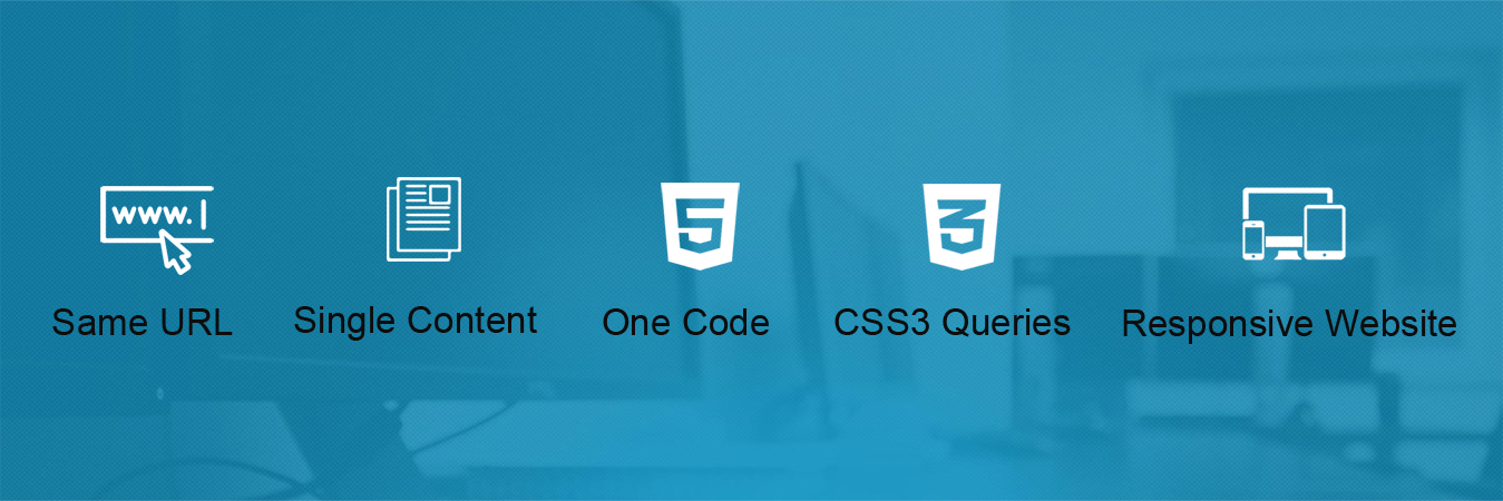
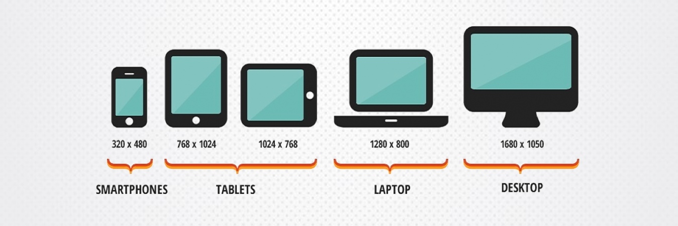
90% of people are switching to multiple screens to browse the internet! So, to target all your potential clients it’s important to have a website that is optimized for all devices. Responsive websites have a single URL and HTML code which gets optimized according to the screen resolution on which it is opened thus giving an optimum viewing experience. Past five years have brought a flood of web enabled devices including Smart Phones, Kindles, Tablets, Net Books and, the newest addition, Phablets. This has popularized the responsive design concept amongst web entrepreneurs and businesses.
Top 3 Reasons why you need a Responsive Design


Responsive Design - Technical Details
Responsive websites use CSS3 media queries, fluid proportion-based grids, and flexible images to create a visual experience that remains the same as screen size changes.
While most traditional websites fall apart on smaller screens, responsive ones adjust text, graphic and other elements as per screen resolution.
A website not optimized for smaller screens cannot cater to mobile users. Responsive ones can, and that too without compromising user experience.
As a company of responsive design experts, we make cutting edge websites that effortlessly fit all machines by adjusting resolution, image size and scripting.