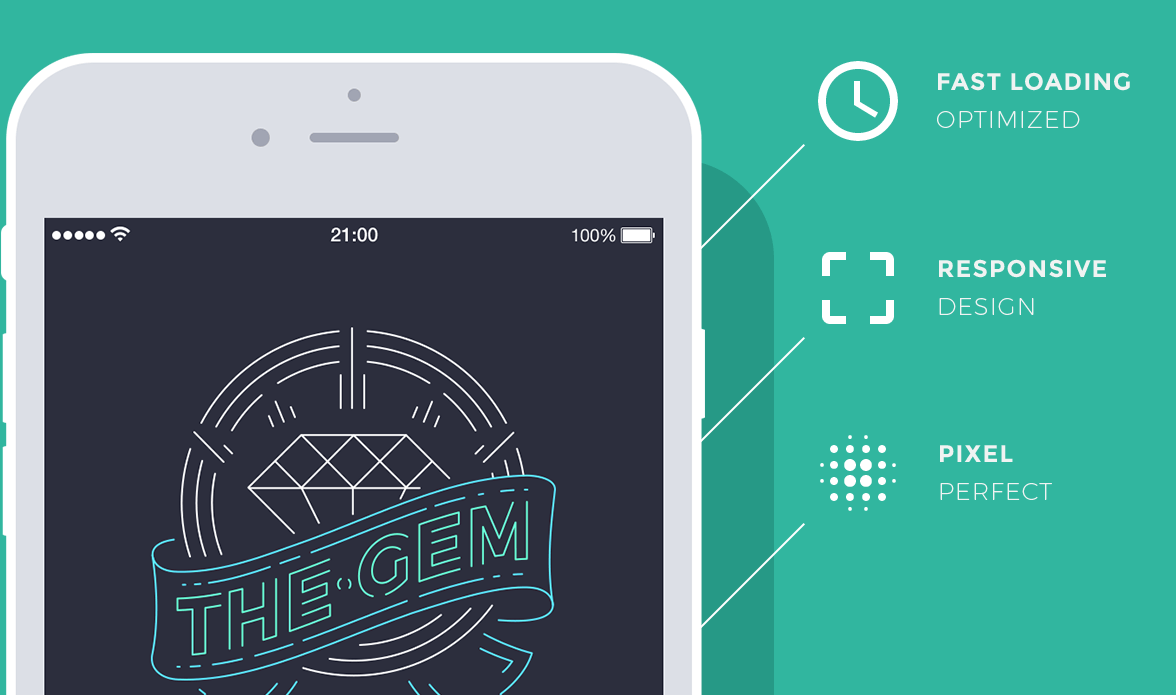
Mobile Website Design
Mobile usage is on a rise! One out off our smartphone owners access internet through their mobile devices. CSism believes that your website should be mobile friendly in order to be accessible and engaging for all type of website visitors.
Are you still speculating the necessity of getting a mobile optimized website? Think Again…
Critical Parameters based on which visitors accept or reject a website
Why Mobile Are Best?

Why is it important for you to GO MOBILE?
1. Your visitors don’t have the time to sit in front of a desktop to do what can easily be taken care of on the move through mobile handsets.
2. 40% of mobile subscribers regularly use their smart phones to browse internet.
3. Mobile searches will overtake desktop searches by 2015 according to a latest survey.
4. One in seven searches is made through mobile. You are surely missing out on a lot of customers if your website is not mobile friendly yet.
5. Over 3,00,000 apps have been developed to cater the ‘smart’ community in the last three years.
6. Online shopping trend is getting popular with each passing day. Mobile commerce is all set to be the next big word.
1. Deliver memorable user experience to your visitors on mobile.
2. Increase your consumer base by widening your mobile reach.
3. Better conversion rate as 90% of search results through mobile result in an action.
4. Website becomes compatible with varied devices that reduces bounce rate.
5. Increased user interaction as 70% of mobile visitors will spend more time on your website if it is optimized to fit their screen size.
6. Stay connected with your customers 24 * 7 as 80% of mobile phone owners don’t leave their house without their mobile.